Free Resume Templates That Recruiters Open —Not Just Download
Published on July 26, 2026
Blogs
Free Resume Templates
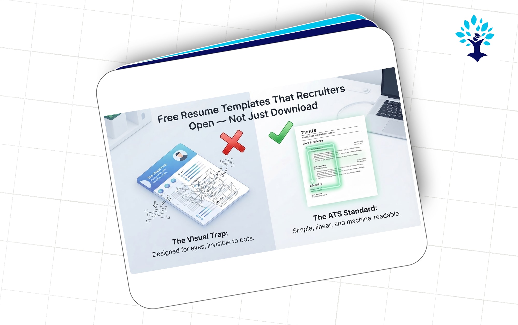
Most resume templates floating around the internet are built to look good in a preview thumbnail, not to survive an ATS scan or a recruiter's ten-second glance. That's the part nobody tells you when you're frantically Googling "free resume template" at 1 AM before a job fair. You end up with a two-column design, five different fonts, and a photo box in the corner — and then wonder why your application disappears into a black hole while your friend with a plain-looking resume gets three interview calls in a week.
If you're a fresher or someone actively applying on portals right now, the template you pick matters almost as much as what you write inside it. This isn't about design taste. It's about whether a machine can read your resume before a human ever gets the chance to.
Why Most "Free" Templates Hurt Your Chances
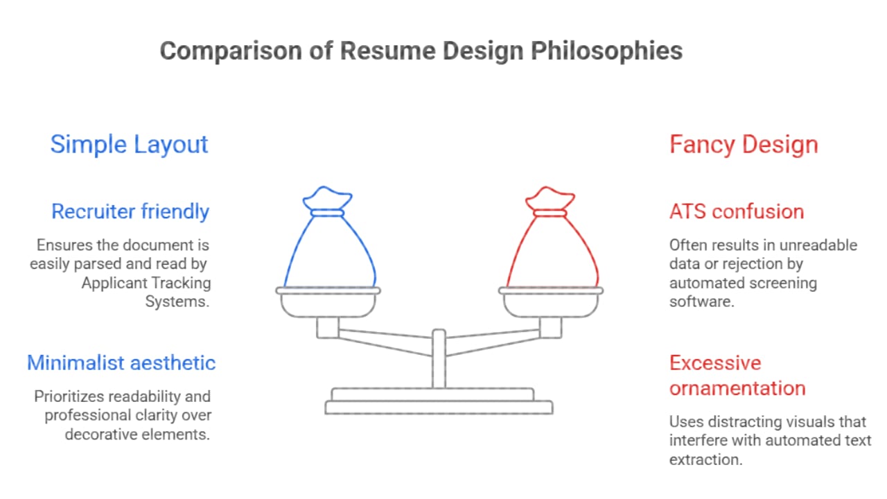
Here's the uncomfortable truth: 70-80% of companies today, especially mid-size and large ones hiring for entry-level or bulk roles, run resumes through an Applicant Tracking System before a recruiter sees them. These systems parse text — they don't appreciate your creative sidebar with icons for "Skills" and a progress bar showing you're 90% good at Excel.
Templates that use tables, text boxes, columns, or graphics for skill ratings often get mangled by ATS software. Your name might end up in the wrong field. Your work experience might get skipped entirely. And you'll never know why, because the rejection email (if you even get one) won't explain it.
This is exactly why plain, single-column, text-based templates consistently outperform the fancy Canva downloads with gradient headers and icon sets.
What a Template Needs to Get Right
A resume template that gets interviews is doing a few things right at the same time — not just one of them:
Single-column layout so the ATS reads top to bottom without confusion
Standard section headers like Work Experience, Education, Skills — not creative, renamed versions like "My Journey" or "Superpowers"
Clean font choices such as Calibri, Arial, or Garamond, sized between 10.5 and 12 points
No embedded tables or graphics for skills, ratings, or timelines
Enough white space so a recruiter's eyes don't glaze over in the first five seconds
Freshers especially tend to overcompensate with design because they feel like they don't have enough experience to fill a page. That instinct is understandable, but it works against you. A recruiter scanning 200 resumes for a campus drive isn't impressed by borders and color blocks — they're looking for relevant keywords, a clear timeline, and a resume that doesn't need decoding.
Where to Find Templates Worth Using
Not every "free template" site is created equal. A lot of them are SEO bait with locked premium downloads or watermarked PDFs. A few sources consistently deliver templates that are both ATS-safe and well-designed without extra effort on your end:
Google Docs' built-in template gallery — the "Serif" and "Swiss" templates are simple, ATS-friendly, and editable without any software cost
Canva's ATS-optimized resume section — specifically the ones labeled ATS-friendly, because Canva also carries a lot of unsafe designs mixed in
Novoresume's free tier — decent structure, though the free version limits customization
Zety and Resume.io free previews — good for structure inspiration, even if you rebuild the content in Word or Docs yourself
If you're applying through Indian job portals like Naukri, Indeed, or company career pages, stick to Word-compatible formats. A lot of portals still parse .docx better than PDF, even though PDF looks cleaner on screen.
Matching the Template to the Job, Not Your Mood
One mistake freshers make constantly is picking a template because it looks nice, without checking if it fits the role they're applying for. A software developer role and a sales executive role don't need the same resume energy.
For technical and IT roles, a minimal template with a strong Projects and Skills section near the top works better than a design-heavy layout — recruiters here care about stack, tools, and what you built
For marketing, content, or client-facing roles, a slightly more visual template is acceptable because these industries expect a bit of personality, but it should still stay ATS-clean underneath
For government or PSU job applications, skip design entirely — stick to a plain, formal format, because most of these go through manual scrutiny with strict formatting expectations
This is where a lot of generic "top 10 resume templates" articles fail you. They show you pretty designs without telling you which one fits your target industry.
Small Formatting Details That Decide Your Fate
Beyond the template itself, small formatting habits determine whether your resume gets read fully or abandoned halfway:
Keep your resume to one page if you have less than 3 years of experience — recruiters spend an average of 6-7 seconds on first pass, and a second page rarely gets opened
Save the file as "FirstName_LastName_Resume.pdf" instead of "resume_final_v3.pdf" — small detail, but it signals professionalism
Avoid headers and footers for contact information, because some ATS systems fail to extract text placed there
Use reverse chronological order for experience and education — it's the format recruiters and ATS parsers are trained to expect
None of this is exciting advice. But interviews are won in these boring details far more often than in a clever design choice.
Building One From Scratch Instead of Downloading
If none of the free templates feel right, building your own in Word or Google Docs isn't as hard as it sounds. Start with your name and contact details at the top, followed by a two-line summary tailored to the role, then Skills, Experience (or Projects if you're a fresher with no work history), Education, and Certifications in that order. That structure alone, without any design flourish, beats most downloaded templates because you control exactly what the ATS sees. Choosing the right template is only half the job. Once you've selected an ATS-friendly format, the next step is filling it with the right content. This guide on how to write a resume that still gets you hired in 2026 walks you through every section, from writing a strong summary to showcasing projects, skills, and achievements effectively.
Freshers applying to jobs on portals similar to how listings appear on platforms like Naukri or Indeed will notice that shortlisted candidates rarely have flashy resumes. They have resumes that are easy to skim, keyword-matched to the job description, and formatted with zero guesswork involved.
The Fresher Trap: Filling Space With Fluff
There's a specific pattern among first-time job seekers — when the resume looks short, they start padding it with generic lines like "Hard-working individual with excellent communication skills" or a hobbies section listing "reading books" and "watching movies." None of these moves a recruiter. It does the opposite, because it tells them you didn't have enough real content to fill the page, so you filled it with filler instead.
A better use of that space is a small Projects section, even if the project was for college or a personal learning exercise. Two or three lines explaining what you built, which tools you used, and what the outcome was will always outperform a soft-skills list that every other candidate has copied word for word. If you truly have nothing to add yet, a shorter, well-formatted one-page resume beats a padded one every time. Recruiters would rather read half a page of substance than a full page of noise.
Final Thought
A resume template isn't the thing that gets you hired — but a bad one is absolutely the thing that gets you filtered out before anyone reads your real experience. Pick something plain, ATS-safe, and built around clarity rather than design. Save the creativity for your cover letter or your portfolio, where a human is guaranteed to see it.